AngularJS: Quiz Design
Saturn's Amazing Moons
This is an interactive quiz created in two versions - one about Saturn, and one about Amazing Moons. The product is designed to be used for educational purposes in a high school setting. While the quiz is a self-directed learning object, it is ideally paired with in-class instruction. Feedback within the final quiz (Amazing Moons), supports further education of the learner by reinforcing the correct answers, even when the wrong selection is made. This design choices ensures an unassisted learner is still getting the information they need to select the correct answer with further attempts.
This short video shows both the Standard Quiz, and the Customized Quiz, which is the final result.
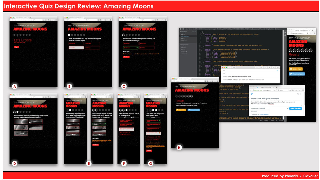
Details for the above image of the final design for the 'Amazing Moons' responsive AngularJS quiz.
- A. We start with a new opening that says, "Let's Explore!" and "Click begin when ready". These subtle tweaks make the opening more casual and focus the learner on the idea that they are explorers, and they're in charge of getting started. You'll also see the revised color scheme, with a crimson red leading font color, and white for sub-headers or minor text.
- B. Here you see that I've added a hover state to all the answers, which is a light grey. This color confirms the action for the learner, before they make a selection, and it allow them to consider their options more closely. I've revised the progress icons to change from transparent to white, before we see a 'Correct' icon added.
- C. Here you see the 'Correct' icon as a cool crescent moon, in line with this moon theme of the quiz. I also revised the check mark used for correct answers, to be square, rather than the marker style originally used. You'll also see that the confirmation text says, "You're right!" all in bold white text, to be sure it stands out. This revised tone is a in line with the revised intro, and helps the learner in a relatable way, ditching the formality of "Correct" or "Incorrect".
- D. The image question took a bit of work to get the images to fill the space as I intended. The choices are all in black and white, to challenge the learner a little more. This was also a case where the feedback was revised to better work with the formatting of the quiz.
- E. This area focuses on two panels, we're now in the mobile device view, which you see as a narrow layout. The image questions change both height and width in this view. The hover action still takes place, and provides the learner an indication of their active choice with a slight border on the left and right of each image.
- F. This shows the hover action again, and leads us to the next panel, where we see some revisions to the way incorrect answers are addressed for a learner.
- G. What happens when an answer is incorrect? The messaging is revised, instead of saying "Oops", which seems rather pedantic, the message simply says, "Hmmm, check your selection". The goal is to turn the learner's attention to their choice, and give them an opportunity to reflect on their selection, even if momentarily.
- H. This shows a completed quiz, with all answers being correct. Note that there's a revision to the way the message about the amount correct is presented. It no longer reads, "6 out of the 6 total questions", as this was too wordy. It now simply reads, "6 out of 6 questions". The larger section of item 'H' shows the live results of sharing on Twitter, or sending an email to challenge a friend.
Objective: Create an interactive quiz using JavaScript and CSS, along with HTML edits to customize questions and feedback. This is for learners of high school age who will complete the quiz in a self-directed manner with more comprehensive instruction.
My Role: Author, Designer, Consultant
Results: Two interactive quizzes able to be deployed online, with a responsive design supported in a mobile environment.
My Role: Author, Designer, Consultant
Results: Two interactive quizzes able to be deployed online, with a responsive design supported in a mobile environment.


